Archives for category: School

Part of my goal with my blog is showcasing my own work, the process behind it, and the client or class it was produced for. So I give you: my first project for my Advanced Typography class:

Typography 2: a big jumble of letters

Of Chico State’s Graphic design program, no classes are more essential than the two typography courses. They are considered the bread and butter of what we learn, and really serve as the basis for everything else. So for this project, we learned about two of the most important schools of design, Modernism and Postmodernism. We were required to use quotations, words, and typography to best explain what Modernism is, and best explain what Postmodernism is.

This discussion is hard without an explanation of what these two terms mean, so I’ll try to explain briefly:

Modernism is as old as graphic design, as we know it. Forged in the Bauhaus school during the 1920s, Modernism characterizes formal, clean, informative design.  Sans-serif type is a hallmark of modernist design, and the goal is to be invisible: design should be there to accentuate the message and make it as easy and as educational as possible.

Postmodernism is essentially a rejection of Modernism. Instead of clean, invisible design, Postmodernism stresses expressive typography; conveying a message in another layer of meaning: with the way the type is displayed. There’s more to it than that, but if Modernism’s hallmark is sans-serif typography, Postmodernism’s is layers. Especially layered type. See David Carson’s work.

The Early Process

We started, really, with a famous essay by early graphic design critic Beatrice Warde, entitled “The Crystal Goblet or Printing Should be Invisible.” Written in 1937, the essay embodies the ideals of the Modernist movement, as it stresses allowing typography and printing to be a “crystal goblet” in which to hold the message.

This, of course, didn’t happen in a day. After a short exercise in typesetting the essay, we began to design our posters. And I had a ton of questions. Landscape? Portrait? Do I separate the two schools of thought or let them intermingle? How many quotes should I use? What typefaces should I select?

It began slowly, and I tested different typefaces, layering techniques, colors, and layouts. I set “The Crystal Goblet” at least six different times, in different typefaces and styles. I decided to separate Modernism and Postmodernism down the middle, but it wasn’t until much later that I had the realization that the two should intermingle. That was an idea I had after the project was officially due.

Refinement & Tweaking

When school piles up on you, some projects fall by the wayside. This one nearly did. I had a poster that I thought was “good enough” and tried to force it to work. In fact, I was pretty much going to do the whole thing in a two-hour class period the day it was due. It would have worked, except that we got an extension.

So that’s how I found myself, the day before it was due, working long hours in the library basement, where I work as a graphic designer for the school, designing the hell out of this poster. I knew what I wanted it to look like, and I had found the time to make it work.

The type began to layer, the two sides began to intermingle, and the color sprang to life. And just like that, I had a poster. I added quote after quote, and then deleted quote after quote, until I was completely satisfied with the way it all turned out.

Diagram & Lessons Learned

The most important part of this project was assembling the process book. Sure, the poster itself is important, but the lessons we learned and the process we had to go through were arguably more vital. So I wanted to show you a diagram from my process book that explains what the heck everything is.

An explanation of the poster

Doing this project forces me and my classmates to learn what Modernism is, what Postmodernism is, and where both of them fall in the realm of graphic design. We’re forced to think about both of these as a separate movements, and how they effect graphic design today. There isn’t a discernible “phase” design is in right now, and we’ll be the ones who have an effect on what that next phase is.

I’m interested, of course, in what you think. It’s not my best work, but it’s an exploration.
20120123-084327.jpg

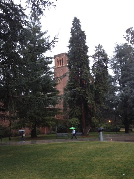
I’m often struck by how “ivy-league” Chico state looks. The grass lawns surround old brick buildings, standing long before all the current students’ time. Tree branches grow, ever slowly, high above the buildings and the students entering and exiting.

When it rains here, the “ivy-league” look is ramped up; the fog and overcast skies reminiscent of Massachusetts or Maryland. It’s a nice time of year, here, even though I’m constantly getting wet.

Look at all that free time!

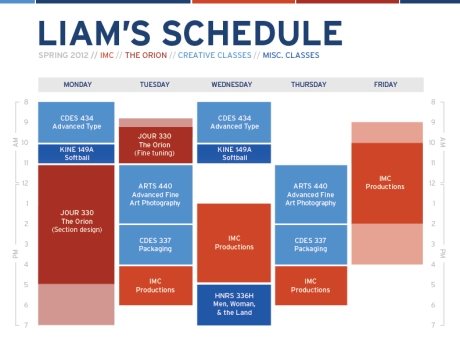
My weekly schedule for the semester, balancing IMC, The Orion, and my classes

I’m entering my eighth semester at Chico State. I’m past the part of college where the whole experience is new and exciting, and not yet to the point where it’s exciting because I’m nearly graduated (I still have another year after this semester). I can see the light at the end of the tunnel, but I’m still in the middle-gray zone as far as school goes.

I’m lucky; my major is interesting to me and I know I’m studying what I really want to study, so my classes haven’t bogged me down too much. On the contrary, they’ve actually all been pretty damn interesting. So as I begin the twilight of my collegiate life, things are still looking up.

The New Internship — IMC Productions

But talk about busy! This semester will probably be my most diverse and most busy yet. A year and a half ago, I added The Orion to my workload. This semester, I’m adding another graphic design internship at IMC Productions. IMC is an on-campus production facility, and actually a pretty diverse organization; tackling everything from video production, website management services, public relations, and print & design. That’s the category I’ll (presumably) be working with. And I can’t wait!

I have my orientation for the new position tomorrow, and I’ll put up a pretty lengthy post and keep everyone updated. As of now, I’m not entirely sure what I’ll be doing.

The Orion, or, There and Back Again

Plus, I’m staying at The Orion, as sports designer for the talented sports editor, Allie Colosky. I’m looking forward to getting my hands dirty with editorial design again. The last year I’ve had to pinch hit for my staff occasionally but I haven’t had a regular, consistent section to design. And it’s going to look goood. Sports (Section B) will be competing with another high-octane editor-designer duo: another former art director, Mark Rojas, and hotshot editor Ben over in the features section (section D, for those of you who are wondering).

But Allie and I have this in the bag. I’m looking forward to a stake-raising design game.

Oh yeah, I’m taking classes too. 

I’ll no doubt be up to my neck in design this semester. For the first time, I have a chance to really immerse myself in design work, with The Orion and IMC such big parts of my week. I’m also taking three different creative classes! I’m finally taking Advanced Typography, something I avoided as Orion art director because I could never get enough sleep, and it’s an 8 am class. But type has always been one of my favorite design subjects, and I’ll be glad to go back to it.

I’m taking Packaging as well, with Chico State design legend Gregg Berryman (he started the design school!), another class I’m looking forward to. The best part of this class is that it’s something I’ve always wanted to get my hands on as a designer but never had the chance to. I get to think in three dimensions! Oh, and Samantha‘s in class with me.

The other class Samantha and I share is probably the most unique class I’ll take this semester: Fine Art Photography. I’m a little apprehensive, because although my foray into photography (high school) was a fine art style, I’ve been studying the less traditional forms of photography during my time in college. My favorite classes so far have been photography classes, and I’m looking forward to getting back into it on a regular basis now.

I’m also going to get a little more exercise, with a 2-day a week Softball class. Nothing exciting, but I figured it was time to take P.E. classes again (I used to, but life got busy).

Finally, there is the enigma that is Men, Women & the Land. It’s an upper division honors theme class; something I need to complete for my upper division theme. I have very little knowledge of what the class will cover, but I’m interested. It’s these kind of classes that usually surprise me by broadening my perspective.