Archives for the month of: February, 2012

My dad and my girlfriend are as big of San Francisco Giants fans as I am. Maybe even bigger fans. But if there’s one problem they have with the Giants, it’s with their uniforms. Let me explain.

My dad, an illustrator, and my girlfriend, an up-and-coming hotshot designer, pay very close attention to typography (as do I). This happens everywhere. Television. The mall. Packages. Advertisements. Baseball games. So when it comes to watching our beloved Giants, my dad and my girlfriend notice one big thing:

Freddy Sanchez - San Francisco Giants (Image: Zuma Press)

‘GIA  NTS’

Oh, the kerning. The kerning! While I acknowledge that this kerning issue exists, I think it’s irrelevant. I know what you’re thinking. “Some weird typography thing, and this designer guy says it’s irreleveant? Some kind of designer. Sheesh.” I’ll explain, after some back story.

During the baseball season, I must hear something about the uniform gap every week. “It looks like a second grader sewed these numbers on,” my dad will say. “Why don’t they go back to the old uniforms? They didn’t used to look like that.”

He’s right, of course. The Giants’ home uniforms used to employ the block/chiseled serif front without the gap.

Chris Graythen/Getty Images (from bleacherreport.com)

(I want to add that it’s actually pretty odd the Giants moved away from this. Why?)

Take a look at this older production shot of former shortstop Rich Aurilia, circa ‘when he had graying facial hair’. The ‘A’ and the ‘N’ physically touch! Actually, physically touch! The ‘A’ splits the gap, and is (presumably) printed on both sides of the uniform, creating a gapless look. It looks good. And tight. Except …

This is baseball. Baseball isn’t necessarily about the looks. Baseball teams don’t need flashy uniforms, or Nike’s jersey ingenuity. Baseball teams need traditional uniforms. Classic looks. That’s why the league has moved away from the weird powder blue looks made popular (infamous?) by the Phillies. Away from the pullovers, and away from the myriad ‘alternate’ looks. Back to classic.

How’s this relate to the Giants’ kerning problems? I don’t think the kerning looks great, but I also think it would be strange to have the edge of the ‘A’ printed again, like on Aurilia’s jersey. But that’s my point: It doesn’t matter!

It doesn’t matter how the kerning is on the uniform. That’s the last thing I’m watching when I’m watching a game. Baseball is a game about getting dirty, playing with your heart, and hustling. They’re still my team, good kerning or bad.

So, ‘GIANTS’ or ‘GIA  NTS’? I’ll take ’em either way.
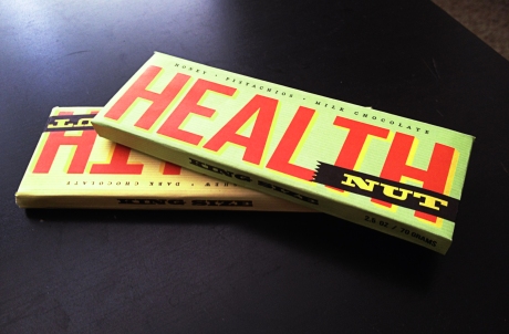
(The final design. Read the post to find out how I got here!)

One of my favorite classes this semester (in fact, probably my favorite class) is Packaging. Taught by our esteemed professor, Gregg Berryman (who started the Chico State design program forty years ago), the class is a survey of package design: we look at basic package exterior design, structural design, package systems, and all the work that goes behind a design (like design briefs, client reactions, all that stuff).

Packaging is such a fun class because it’s very real. While the projects are school projects, in that we get to spend a lot of time on them and there are little restrictions, unlike the real world, Gregg does his best to provide us with real critique and real feedback, not to mention a down-to-earth product.

Gregg is a great guide through all this. He knows his packaging, and he’s refined his teaching method over years and years in this profession. (I’ll do a post sometime on the man himself, but not today).

Health Nut

Our first project of the semester: a candy/health bar crossover called Health Nut. We were asked to provide several examples, and create a system out of them. So when I got home, ready to work on the project, I got right to work. (Not really. I did some other homework and watched some television. Then I ate dinner, probably, and went online. Then I got right to work).

The basics were this:
• 2 package designs, both bar wrappers
• 1 was a dark chocolate & pistachio bar
• 1 was a milk chocolate & cashew bar
• both were ‘sweetened with honey’
• the two wrappers had to be closely related

First, I did some research. And by research I meant, I went to the store and bought candy bars. If you’re an avid reader of my blog, you’ll remember my WinCo grocery store post, where I claimed I bought candy for class. Well, here’s proof.

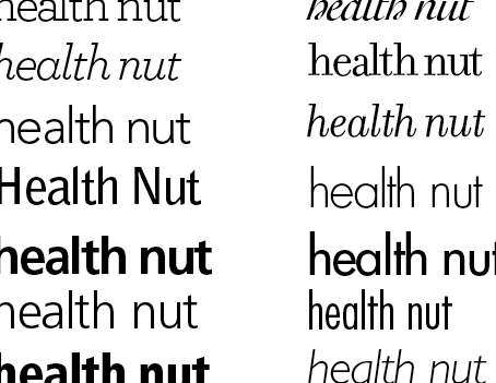
But the real first test was to try out six hundred and twelve different typefaces in Illustrator, and see which ones stuck. 

Here’s all 612 of them. Or something like that. It was a lot, okay?

The next step, in any class taught by Gregg Berryman, is to move to the markers. Great, big, expensive, Prismacolor markers, and specialized Bienfang brand marker paper. But it’s all for a purpose:

It produces these beautiful sketches. Beautiful might be a stretch. It produces these … sketches. (Ignore the sunstreak on the left). This is really the ideation part of the whole project. This is where the ideas flow, and where the design is really made or broken. If you can make the connection, the final design (at the top of the post) grew out of the yellow sketch on the far left with the big, bold, red type. Best part: that was just freehand. I didn’t sketch anything. (Why do those always end up being the idea?)

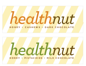
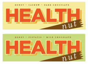
So what comes next? A move to the computer. And these guys:

Of course, the latter would eventually evolve into my final design. I didn’t know it yet, of course. I wasn’t even sold on it myself. But that’s the one that the class liked the best and that Gregg was drawn to. From there, it was a pretty easy decision. Another couple of tests, and I was left with my final product:

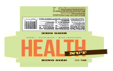
Complete with nutrition facts, a UPC, and ingredients! I’m pleased with how it all turned out in the end. This, of course, is ditto for the yellow version. I decided in the end to lose the stripes on the backside (for the sake of realism, it would be impossible to line those up with every produced candy bar) and re-do the type and the stripe so it looked a little more old-school.

The last step was creating the bar itself. Finally, the design is fully realized and it becomes three-dimensional. I used foam core as filler and wrapped the package around it! That’s what’s shown in the shot above.

There you have it! That’s how I produced my first package design. Oh, and it’s due today.

For any type nerds out there: 
Filosofia, all small caps, is used for the ingredients list on the face.
Bebas Neue (a stretched version) is the main word ‘Health’, as well as the net weight.
Blackoak Std. is  used for ‘Nut’ and ‘King Size.’

How I imagine the moon base will look.

No kidding. As SPACE.com reports, NASA has announced plans that they are moving forward with plans to build a moon base on the dark side of the natural satellite. It will sit in a place known as a ‘libration zone,’ where the gravity of the earth and the moon balance each other out. From there, they posit, they will be able to launch exploration missions to the moon, to mars, to the asteroid belt, etc.

HOW FREAKIN’ COOL IS THIS? As a kid, I was obsessed with space. But there wasn’t much going on when I was growing up. The mars rovers were the big pull (I remember my dad going down to target to get a hot wheels model replica for me, but they were sold out), but there weren’t rockets blasting off to the moon, and the International Space Station hadn’t been built yet.

And while the ISS is cool, and it’s pretty fantastic that we have a group of people constantly living outside of the planet, it’s no moon base!

I hope this is the spur NASA needs and the organization gets back into space exploration. I was disappointed when Obama ended the moon program and didn’t announce anything else major. I wish he had followed it up with “… and we’re announcing plans to go to Mars!” and then climbed into a shuttle and became the first sitting president (any president?) to shoot into outer space. That would have been impressive.

I imagine this moonbase is going to be fantastic. Full of doors that go ‘swoosh’ when they open, an onboard AI computer that can control essential functions (and won’t get all HAL 9000-y), and some sort of awesome racquetball in space type of game. At least, if I was going to spend a ton of money building an awesome floating space station, that’s what I would want.

See Part 1, Introduction

You’re in luck! I’ve just returned (two days ago) from my shopping experience at the wonderful Trader Joe’s! I found it to be pleasing and helpful, with a small enough store that I don’t have to walk everywhere, and even going in around dinner time on a Thursday, the place wasn’t too crowded. So what’s the verdict? Read and find out!

Small Trader Joe’s fights off bargain bin WinCo

WinCo was a no-frills shopping experience, then Trader Joe’s is definitely the frilliest. At Joe’s, you pay for the packaging, the look of the place, the small-town, local store feel, the warm customer service, and the varied selection. I fully expected a pricier shopping experience out of Trader Joe’s for these very reasons.

But it’s not really a bad thing. The selection is amazing! A co-worker remarked today that Joe’s seems to have a store-brand of nearly every kind of merchandise: crackers, stir-fry, salads, wine, cheese, pizza, chocolate — the list goes on. So that’s kind of a good thing, except that usually the Trader Joe’s brand is more pricey than, say, Hy-Top or Safeway brand.

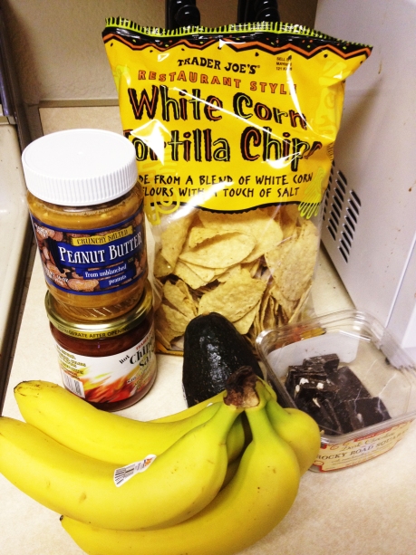
But when it all came down to it, the price difference wasn’t that different at all. Here, let me show you:

Yup. That’s it. Just 50¢ difference, after I paired down everything I bought at both stores.

The Breakdown

1% Milk, half-gallon: $1.99 Trader Joe’s, $1.88 WinCo
Apples, 5–6: $2.95
Trader Joe’s, $1.82 WinCo
Bananas, 1 bunch: $1.14 Trader Joe’s, $1.38 WinCo (I thought Joe’s produce was higher quality)
Avocado, 1: $1.38 Trader Joe’s, $0.78 WinCo (Joe’s was bigger)
Mini Bagels: $1.99 (10-count, unsliced) Trader Joe’s, $4.10 (12-count, pre-sliced) WinCo (I prefer them sliced, but at half price and just two less bagels, I’ll take it).
Stir Fry Meal: $3.99 Trader Joe’s, $3.98 WinCo (even split)
Frozen Pizza: $4.99 (organic) Trader Joe’s, $3.38 WinCo (paying for the label)
Croutons: $2.99 Trader Joe’s, $1.69 WinCo (I prefer my cheap-o croutons, thank you very much)
Chips: $1.79 (White Corn) Trader Joe’s, $1.88 (Potato) WinCo
Crackers: $1.99 (Multigrain) Trader Joe’s, $2.48 (Cheez-It Party Mix) WinCo.
Salad Mix, bag: $1.99 Trader Joe’s, $1.78 WinCo
Candy Bars (2): $1.98 Trader Joe’s, $2.75 WinCo (I cheated a little here, because I got a Toblerone bar at WinCo [expensive] and then two Trader Joe’s branded bars there. So I tried to even it out.)

Verdict

There you have it! Final tally, for all goods purchased at both stores: $29.18 at Trader Joe’s and $28.68 at WinCo. If you are careful about watching your prices at Trader Joe’s, you can get away with a cheaper deal than WinCo. I personally believe the quality of Joe’s food to be a little better.

Extras

Overall, Trader Joe’s cost me quite a bit more than WinCo, but I also brought home more (33 items at Trader Joe’s to WinCo‘s 22). I also purchased alcohol (2 bottles of wine and some beer, that came to about $12) at Joe’s, where I didn’t when I shopped at WinCo. I also stocked up on peanut butter, jam, lunch meat, and cheese, four items I had too much of two weeks ago. Once that’s all set aside, I actually broke close to even.

But go ahead, try it for yourself. See what comparisons you can come up with. I think you’ll find the same thing I did: Not much difference, no more than 50¢.


That’s a wrap! With Tom Brady’s failed hail mary last night, the football season is over, and America’s real pastime can get started.

You may argue with me there. You may say that those pigskin hurtlers in helmets and pads are the true representation of America through sports. You may tell me that football, in all it’s red, white and blue wrapping paper, patriotic music, and games promoted like they’re epic battles between two great armies actually has an edge over America’s first successful professional sport. And that’s okay. You can argue that way. But you’d be wrong.

Baseball is our national pastime because it’s so ingrained in our culture. It’s such a part of the country and its people. Baseball inspires prose like we see above. Walt Whitman spoke of the sport. Hell, even Lewis and Clark taught an early version of the game to Indians, on land that had just been purchased for the US by Thomas freakin’ Jefferson. (No word on whether that’s his real middle name or not). How much more American can you get than Jefferson and Lewis & Clark?

The President is often invited to throw the first pitch out at many a ball game across the country. Does the NFL invite the commander-in-chief over to kick the ball downfield at the start of a contest? After the “Star-Spangled Banner” and “America the Beautiful” comes America’s third-most American song: “Take Me Out to the Ballgame.” The base ballgame.

Baseball is America’s sport because it grew up with the country. When times are tough, baseball is there to inspire confidence again. When kids need a hero, they look to Babe Ruth, or Willie Mays, or Ted Williams, or Ken Griffey, Jr. After the September 11th attacks, baseball took center stage. While the Diamondbacks ruined what would have been a truly American triumph for the Yankees (a sentence I will never again utter), the sentiment stands.

Tradition Begins Anew

Four long months of nothing but player negotiations and trades are nearly over. Soon, we’ll have real baseball to talk about. You can almost hear the pop of the baseball hitting the padded leather of a mitt, breaking the silence that has lasted since Cardinal Allen Craig caught the last out of the World Series way back in October.

Soon, pitchers and catchers will report to spring training (mere days!). Soon, we’ll have the smell of freshly cut grass, still wet from the morning dew. Soon, the sound of mitts slapping, bats popping, and crowds cheering will fill the air. Soon, the spring sun will warm the players’ faces and the fans’ hearts, as another season of our great sport starts up again. Spring training is upon us.

(For the first time, I’m lucky enough to head down to Scottsdale and watch the Giants play this March! It’s something I’ve always dreamed of attending, and I’m lucky enough that my girlfriend and her family have invited me along). 

So what’s that mean? For a Giants fan like myself, it means Tim Lincecum and Buster Posey (and the rest of the pitching and catching staffs) will be reporting to Arizona in just 12 days. It feels like it’s been a long winter. I’m rabid. I can’t get enough baseball news. I read the entire report on Josh Hamilton’s relapse with alcohol because he’s a baseball player.

I can’t wait to hear the classic voice of Jon Miller and young’n Dave Flemming, San Francisco’s radio guys, as well as the classic Kruk and Kuip duo on the radio. Even better, I can’t wait to be in Arizona, watching my team play. It’s going to be renewing, refreshing, and exciting. Even better than that, I can’t wait to sit my butt down at AT&T park and watch them compete.

Nothing, however, compares to the feeling of playing the game yourself. I signed up for a softball class this semester to get some action in. I miss, more than anything else, playing the game. Sliding on the cleats and the glove, pulling on a hat, and tossing a ball around. We start games on Wednesday!

America’s pastime is here. I’m ready to play, coach.